Choosing the right mid-century modern home colours is one of the most important steps in creating a timeless and stylish home. Mid-Century Modern design is known for its clean lines, simple forms, natural materials, and carefully selected colour palettes. The colours used in this design style help create a balance between comfort, functionality, and visual appeal.
From warm earth tones and natural greens to bold accent shades, the right colour choices can completely transform your home.
Understanding Mid-Century Modern Home Colours
What Defines Mid-Century Modern Design?
Mid-Century Modern design emerged between the 1940s and 1960s. It focused on simplicity, practicality, and a strong connection to nature. Designers favoured open spaces, large windows, and minimal ornamentation.
Some defining features include:
- Clean architectural lines
- Functional furniture
- Natural wood materials
- Open floor plans
- Strong indoor-outdoor connections
Colour played a major role in supporting these features. Designers selected colours that complemented natural materials and highlighted architectural details without overwhelming the space.
Why Colour Is Essential in Mid-Century Modern Interiors
Colours help establish the personality of a Mid-Century Modern home. The right palette can:
- Create visual balance
- Highlight natural wood furniture
- Enhance natural light
- Add warmth without clutter
- Maintain a minimalist appearance
Instead of using dozens of colours, Mid-Century Modern spaces rely on a carefully selected palette that creates harmony throughout the home.
Popular Mid-Century Modern Home Colours

Warm Earth Tones
Earth-inspired colours are among the most recognisable Mid-Century Modern shades.
Mustard Yellow
Mustard yellow adds energy and warmth. It works beautifully in living rooms, dining areas, and accent furniture.
Burnt Orange
Burnt orange creates a classic retro appearance. It pairs exceptionally well with walnut wood furniture and neutral walls.
Rust Red
Rust red introduces depth and character. It can be used in rugs, artwork, or accent chairs.
Terracotta
Terracotta offers a warm and natural look that connects indoor spaces with outdoor surroundings.
Nature-Inspired Greens
Green shades were extremely popular during the Mid-Century Modern era because they reflected nature.
Olive Green
Olive green remains one of the most iconic Mid-Century Modern colours. It adds sophistication while maintaining a natural feel.
Moss Green
Moss green creates a grounded and organic atmosphere.
Sage Green
Sage green offers a softer, more contemporary interpretation while still fitting perfectly within Mid-Century aesthetics.
Cool Blues for Contrast
Blue tones provide balance against warm woods and earthy colours.
Teal
Teal is a signature Mid-Century Modern colour. It adds vibrancy without feeling overwhelming.
Turquoise
Turquoise introduces a playful retro vibe and works particularly well in kitchens and bathrooms.
Deep Navy Accents
Navy blue adds depth and contrast while maintaining a sophisticated appearance.
Neutral Foundation Colours
Neutral colours serve as the backdrop for stronger accent shades.
White
Warm whites create bright, airy spaces.
Cream
Cream adds softness and warmth.
Beige
Beige works exceptionally well with wood furniture and natural materials.
Soft Gray
Grey offers a modern touch while preserving Mid-Century style.
Bold Accent Colours
Accent colours add personality and visual interest.
Avocado Green
A classic retro favourite that instantly evokes Mid-Century charm.
Golden Yellow
Golden yellow brings warmth and optimism.
Coral
Coral introduces playful energy.
Walnut Brown
Walnut brown provides richness and complements almost every Mid-Century palette.
How to Choose the Right Mid-Century Modern Colour Palette
Consider Your Home’s Architecture
The architectural style of your home should influence your colour choices.
Ranch-Style Homes
Ranch homes often look best with warm neutrals, earthy greens, and natural wood tones. These colours emphasise the home’s horizontal lines and connection to nature.
Split-Level Homes
Split-level homes benefit from balanced colour schemes that help create visual flow between different levels.
Contemporary Mid-Century Structures
Modern interpretations of Mid-Century homes often work well with cooler neutrals and bold accent colours.
Evaluate Natural Lighting
Lighting dramatically affects how colours appear.
Colours for Bright Rooms
Rooms with abundant sunlight can handle deeper and richer colours such as:
- Olive green
- Teal
- Burnt orange
- Navy blue
Colours for Darker Spaces
Darker rooms generally benefit from lighter shades such as:
- Cream
- Soft beige
- Warm white
- Light sage
Impact of Sunlight on Paint Appearance
Always test paint samples before making a final decision. Colours may appear different throughout the day as natural light changes.
Match Existing Materials
Mid-Century Modern design celebrates natural materials.
Wood Tones
Walnut, teak, and oak should influence your colour palette choices.
Stone Features
Natural stone often pairs well with earthy greens, warm greys, and soft neutrals.
Brick Elements
Brick accents work beautifully with olive green, cream, charcoal, and terracotta.
Follow the 60-30-10 Colour Rule.
The 60-30-10 rule creates balance and prevents visual clutter.
Dominant Colour (60%)
This is your primary wall or background colour.
Secondary Colour (30%)
This colour appears in furniture, rugs, and larger decorative pieces.
Accent Colour (10%)
Accent colours add personality through pillows, artwork, and accessories.
For example:
- 60% Warm White
- 30% Walnut Brown
- 10% Mustard Yellow
This combination creates a classic Mid-Century Modern look.
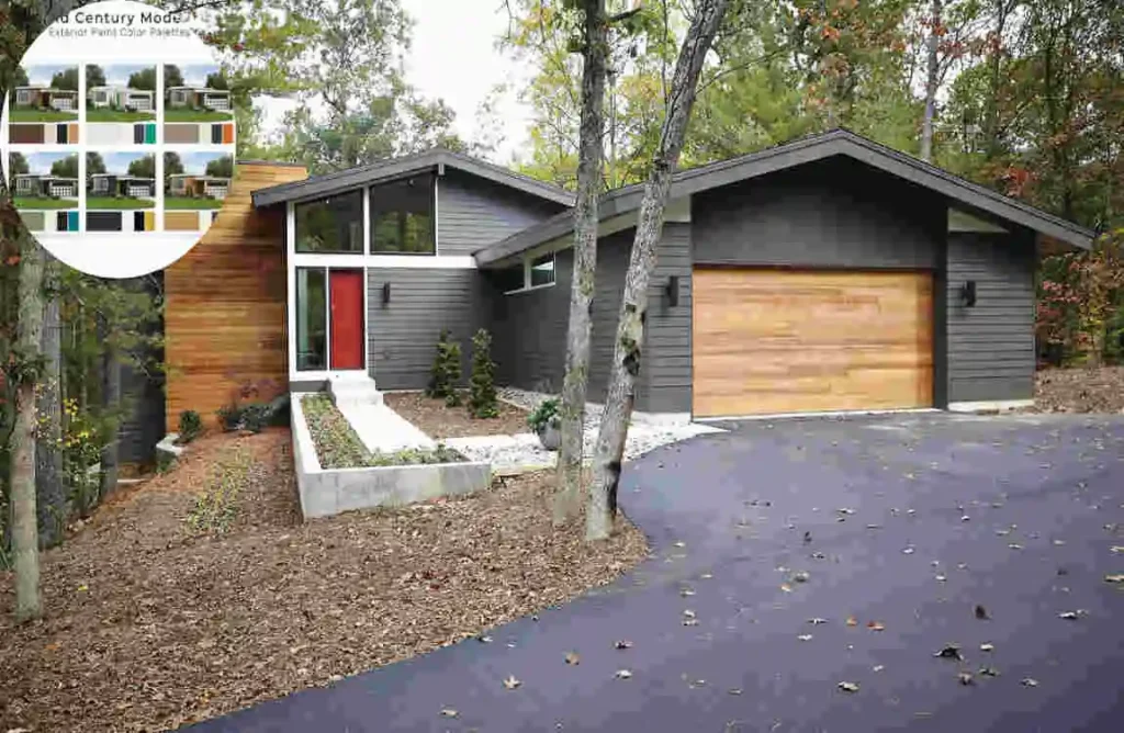
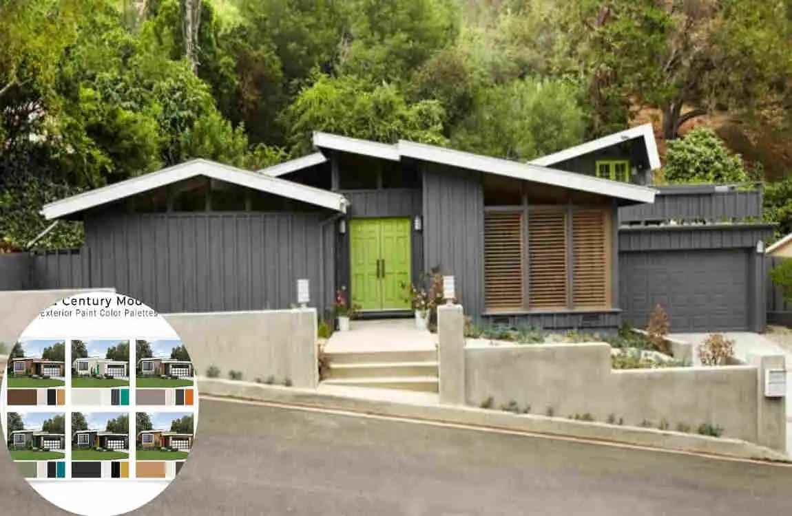
Best Exterior Mid-Century Modern Home Colours
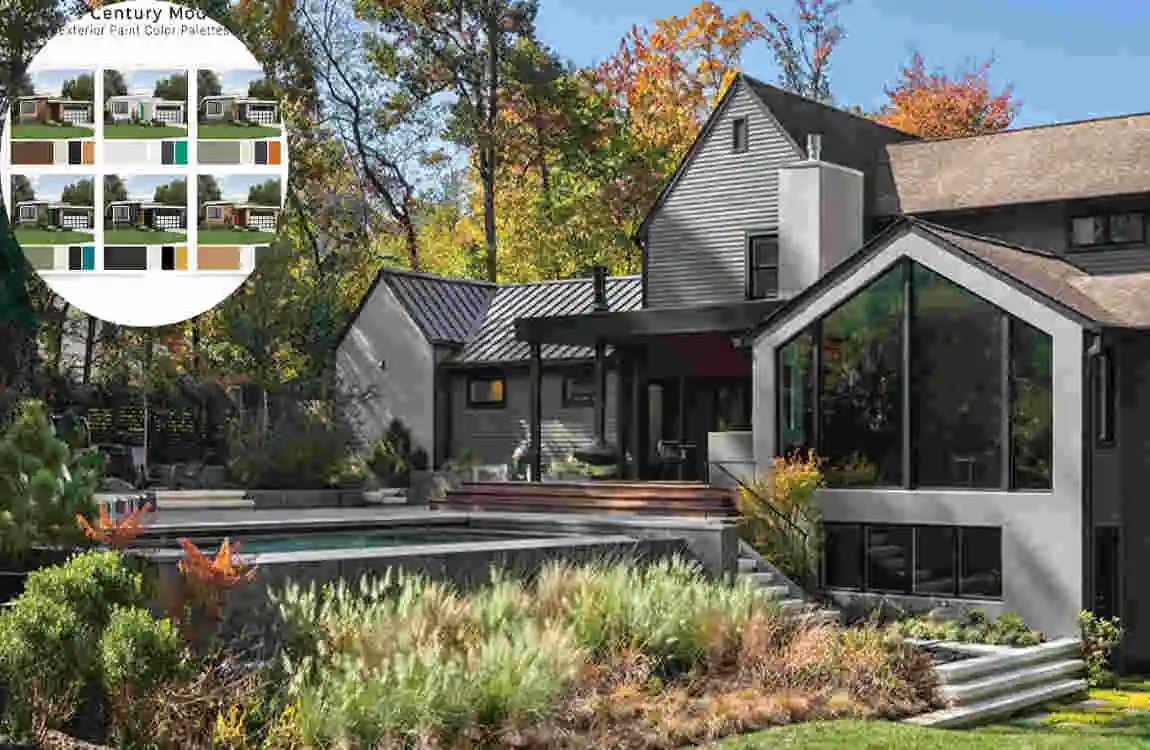
Classic Neutral Exterior Schemes
Neutral exteriors never go out of style.
White and Walnut
This timeless combination highlights architectural details while maintaining warmth.
Grey and Black
Grey siding with black accents creates a sleek and modern appearance.
Beige and Brown
This pairing delivers a welcoming and natural aesthetic.
Bold Exterior Colour Combinations
Homeowners who want more character can explore bolder combinations.
Teal with Wood Accents
Teal adds personality while natural wood maintains balance.
Olive Green and Cream
This combination blends beautifully with natural landscapes.
Charcoal with Orange Accents
Charcoal creates a dramatic foundation while orange adds retro charm.
Choosing Exterior Trim Colours
Trim colours can significantly impact curb appeal.
Black Trim
Creates strong architectural contrast.
White Trim
Provides a crisp and clean appearance.
Natural Wood Trim
Enhances warmth and authenticity.
Best Interior Mid-Century Modern Colour Schemes
Living Room Colour Ideas
The living room is often the centrepiece of a Mid-Century Modern home.
Warm Neutrals with Colourful Accents
Start with cream or beige walls and introduce mustard yellow, teal, or rust orange through furniture and accessories.
Earthy Palettes with Wood Furniture
Combine olive green, walnut brown, and warm white for a comfortable and timeless space.
Kitchen Colour Ideas
Mid-Century Modern kitchens balance functionality with style.
Teal Cabinetry
Teal cabinets add personality without overwhelming the room.
Mustard Accents
Mustard bar stools, lighting fixtures, or décor pieces create a retro-inspired look.
White and Walnut Combinations
White surfaces paired with walnut cabinetry remain one of the most popular Mid-Century kitchen designs.
Bedroom Colour Ideas
Bedrooms should feel calm and relaxing.
Soft Greens
Sage and olive green create a peaceful environment.
Warm Beige Tones
Warm beige walls help create a sense of comfort and simplicity.
Cozy Retro-Inspired Palettes
Combining walnut furniture with cream walls and rust-colored accents creates a welcoming retreat.
Bathroom Colour Ideas
Bathrooms provide opportunities to introduce classic Mid-Century colours.
Vintage-Inspired Colour Combinations
Teal, turquoise, and white remain popular choices.
Modern Updates with Classic Tones
Mix traditional Mid-Century colours with contemporary fixtures for a fresh appearance.
Common Mistakes to Avoid When Choosing Mid-Century Modern Home Colours

Using Too Many Bright Colours
Mid-Century Modern design embraces bold accents, but too many bright colours can make a space feel chaotic.
Focus on one or two statement colours rather than filling the room with multiple vibrant shades.
Ignoring Natural Materials
Natural materials are central to Mid-Century Modern design.
Wood, stone, and brick should guide your colour decisions. Colours that clash with these materials can make the design feel disconnected.
Choosing Trendy Colours Over Authentic Ones
Trends come and go, but Mid-Century Modern design relies on timeless palettes.
Authentic colours such as olive green, mustard yellow, teal, and warm neutrals often provide better long-term results than temporary trends.
Overlooking Lighting Conditions
A colour that looks perfect in a showroom may appear completely different in your home.
Always test paint samples in different lighting conditions before making a final commitment.
Tips for Creating an Authentic Mid-Century Modern Colour Palette
Start with Neutral Backgrounds
Neutral backgrounds create flexibility and balance.
Popular choices include:
- Warm white
- Cream
- Beige
- Soft gray
These shades allow accent colours and furniture to stand out naturally.
Add Vintage-Inspired Accent Colours
Once the neutral foundation is established, introduce classic Mid-Century accents.
Popular accent colours include:
- Mustard yellow
- Olive green
- Teal
- Rust orange
- Coral
Use these colours strategically rather than excessively.
Incorporate Natural Wood Elements
Natural wood is one of the most important elements in Mid-Century Modern design.
Wood brings warmth, texture, and visual contrast to the space. Walnut, teak, and oak remain popular choices because they pair beautifully with both neutral and bold colours.
Keep the Design Simple
Simplicity is a defining principle of Mid-Century Modern interiors.
Avoid overcrowding rooms with excessive patterns, colours, or decorative items. Instead, focus on clean lines, functional furniture, and a carefully curated colour palette.
A simple approach often creates the most authentic and visually appealing results.
Frequently Asked Questions (FAQs)
What are the most popular mid-century modern home colours?
Popular Mid-Century Modern colours include mustard yellow, olive green, burnt orange, teal, walnut brown, cream, warm white, and sage green.
What colours work best for a mid-century modern exterior?
Neutral shades combined with natural wood, charcoal grey, olive green, cream, and white are among the most popular exterior choices.
Can I use modern paint colours in a mid-century modern home?
Yes. Modern paint colours can work well as long as they complement the clean lines, natural materials, and retro-inspired character of Mid-Century Modern design.
Is grey a good colour for mid-century modern homes?
Absolutely. Warm grey provides a modern appearance while pairing beautifully with wood furniture and colourful accents.
How many colours should a mid-century modern room have?
Most designers recommend following the 60-30-10 rule, using one dominant colour, one secondary colour, and one accent colour.
What wood tones pair best with mid-century modern home colours?
Walnut, teak, oak, and other warm-toned woods pair exceptionally well with Mid-Century Modern colour palettes, adding warmth, texture, and authenticity.
| Step | What to Do | Key Colors to Use | What to Avoid |
|---|---|---|---|
| 1. Start with neutrals | Begin with warm, earthy base tones | Cream, soft beige, rich brown, warm gray, charcoal | Stark white, icy gray, pastels |
| 2. Add earthy accents | Layer in organic, muted tones | Olive green, burnt orange, mustard yellow, brick red | Neon colors, bright lime green |
| 3. Include bold pops | Use rich colors sparingly for contrast | Rich teal, turquoise/aqua, cherry red, golden yellow | Overly cool tones, brassy accents |
| 4. Pair with materials | Match colors to natural wood & stone | Ochre, brown, mustard yellow with walnut/teak | Colors that clash with wood tones |
| 5. Test combinations | Pull palette from inspiration pieces (rug, pillow, art) | Navy/rust/grey, deep green/mustard/pale blue | Random color choices without cohesion |
