
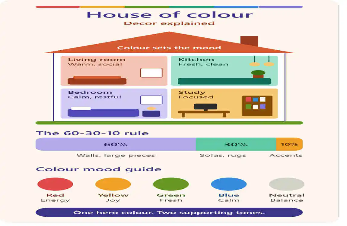
House of colour decor is a colour-led way of decorating a home, where paint, furniture, textiles and accessories are chosen as one planned palette instead of as separate buys. It is not a single official design style with strict rules. The phrase is used in a few different ways, which is why searchers often get mixed results.
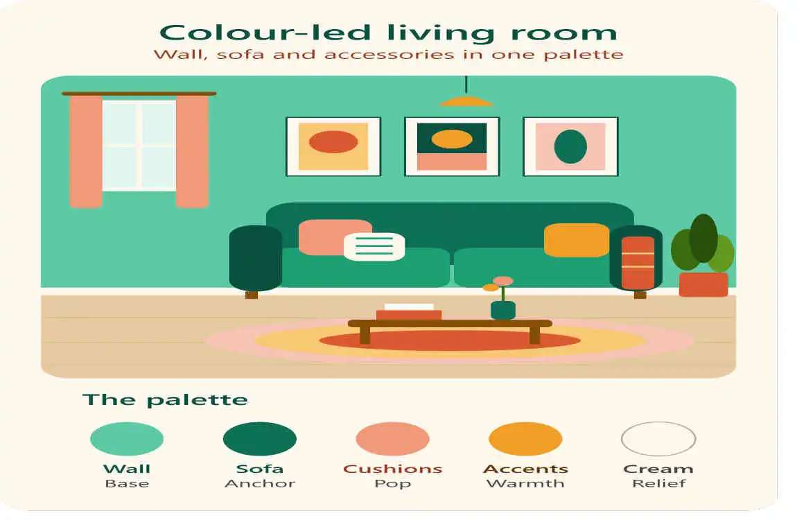
The Three Meanings of “House of Colour”
A Home Decorated Around Colour
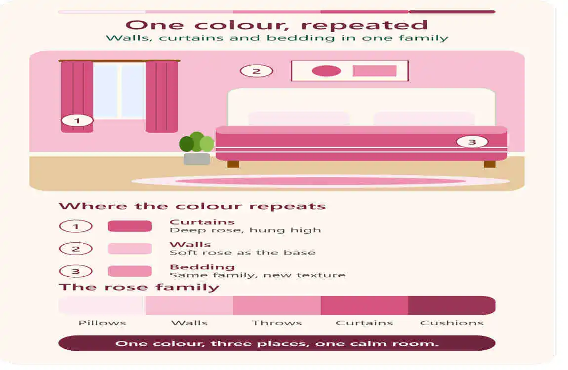
This is the meaning most people want. Think of a decor house where each room has its own colour mood, yet the whole home feels connected. Interior designer Rhonda Drakeford created exactly this for a photoshoot house she and the plant brand Patch used in autumn 2024. According to Patch’s behind-the-scenes feature, each core colour in the house came with roughly five or six neighbouring shades. The result was a cohesive scheme rather than a patchwork. She also stressed that where a colour appears, and how much of it you use, matters just as much as the colour itself.
A Colour Selection Studio
In the building industry, “House of Colour” is also the name of a design studio. Australian builder Fowler Homes uses it for an internal selections studio where buyers choose finishes, materials and fixtures in one place. Stockland’s interview with Fowler Homes’ interior design manager explains that the studio is open by appointment and only to Fowler customers. It was designed to remove the overwhelm of a typical showroom.
House of Colour the Colour Analysis Brand
The UK company House of Colour has offered personal colour and style analysis since 1985. Its stylists place coloured drapes against your skin to decide whether your colouring is warm or cool, then assign one of four seasons: Spring, Summer, Autumn or Winter, as described in the company’s own guide to how colour analysis works. This service is about what you wear, not how you decorate. Some people borrow the idea for their homes, but the brand itself does not offer interior design.
What Makes a Home a “House of Colour”?
Whatever name it goes by, colour-led decor shares a few habits.
- A planned palette. Colours are chosen together, usually a small family of related shades.
- Colour with a purpose. IKEA’s colour-block home story shows a homeowner using colour to set a mood and to divide a loft into zones.
- Easy starting points. The same story suggests beginning with one coloured piece of furniture rather than repainting everything.
- Personality over trends. A Houzz project called Colour House was built around a family’s love of colour and art instead of following trends.
- Texture and pattern. Brands like House of Hackney describe their approach as colour, texture and print, with few rules, in an interview on Dulux’s website.
How to Build a Colour-Led Home Step by Step
- Pick one anchor colour. Choose something already in your home that you love: a luxury rug, artwork or a favourite sofa.
- Add neighbouring shades. Follow the Patch house example and gather a handful of lighter and deeper tones of the same colour family.
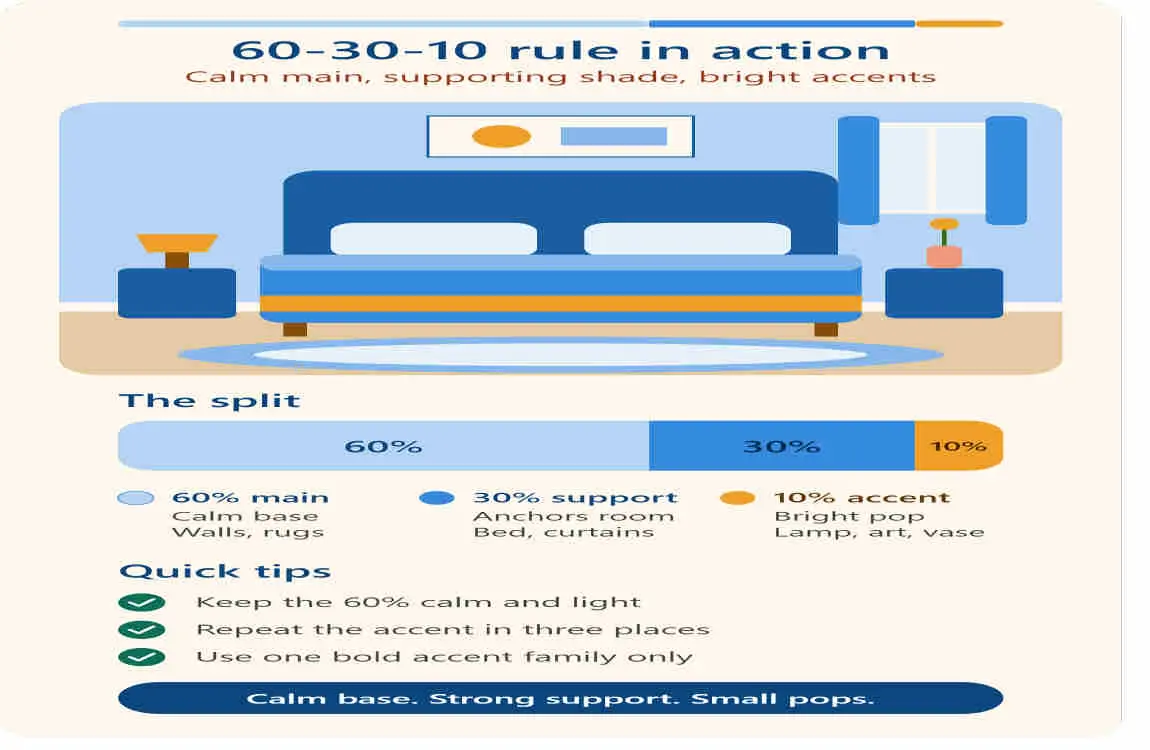
- Use the 60-30-10 rule. Designers often split a room into 60% dominant colour, 30% secondary colour and 10% accent, as explained by Country & Town House. Treat it as a guide, not a law. Bob Vila notes it is fine to break it.
- Repeat colours across rooms. Echo one shade from the living room in the hallway or bedroom so the house feels connected.
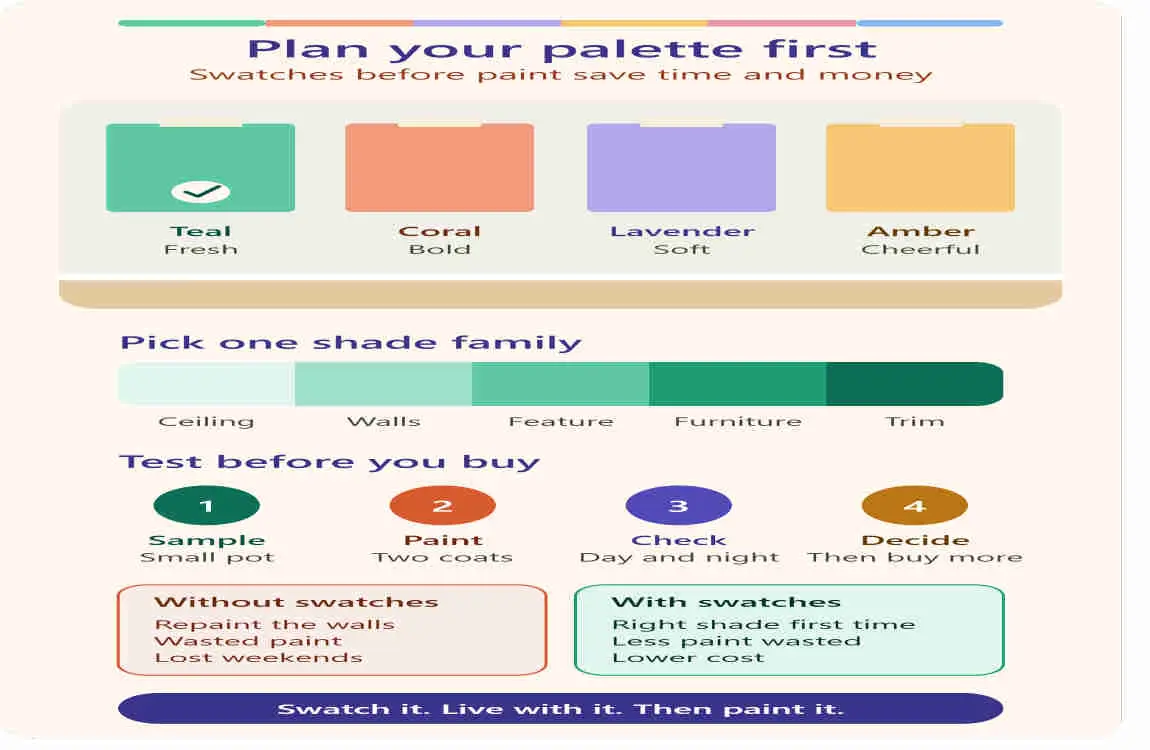
- Test before you commit. Look at paint samples in morning and evening light, next to your flooring and furniture.
2026 Colour Trends to Use in Your House of Colour
Two big names shaped the conversation this year. Pantone picked Cloud Dancer, a soft white, as its 2026 Colour of the Year, and says it represents a fresh start and a calmer mood. Some commentators found the choice bland, but others see it as a flexible backdrop. Meanwhile, Ideal Home reports that Dulux named three blues for the first time as its Colours of the Year for 2026.
The two choices work well together. Paint walls in a soft white, then bring in blue through cushions, ceramics or a statement chair. Interiors retailer Fraser makes the same pairing suggestion, and Australia’s Home Beautiful lists paint whites that come close to Cloud Dancer.
Common Mistakes to Avoid
- Too many unrelated colours. More than three or four main colours can make a room feel busy.
- Ignoring light. North-facing rooms and south-facing rooms show the same luxury paint very differently.
- Forgetting neutrals. White, cream or wood tones give bold colours room to breathe.
- Buying everything at once. Start with one room or one piece and build slowly.
Frequently Asked Questions
What is house of colour decor in simple words?
It is decorating your home with a deliberately chosen colour palette so every room looks connected and intentional.
Is House of Colour an interior design brand?
The best-known House of Colour, based in the UK, is a colour analysis and personal styling company that matches clothing and makeup colours to your skin tone. “House of Colour” is also used as a name by some builders’ design studios and creative projects.
How many colours should I use in one room?
Many designers suggest three: a dominant colour, a secondary colour and an accent, following the 60-30-10 guide. Neutrals like white or wood often do not count as extra colours.
What colours are trending for home decor in 2026?
Soft white (Pantone’s Cloud Dancer) and shades of blue (Dulux’s three Colours of the Year) are leading the 2026 conversation.
Can I add colour without repainting?
Yes. Start with a coloured piece of furniture, then add cushions, throws, art and lamps in the same palette.
Does colour analysis for clothes work for home decor?
Not directly. Seasonal analysis is built around skin, hair and eye tones, while rooms depend on light, size and furniture. You can still use your favourite colours as inspiration.
Final Thoughts
A house of colour is less about following a rulebook and more about making colour choices on purpose. Choose a palette you love, repeat it with care, and let small accents carry the personality. Start with one room, and your home will build its own colour story from there.
